In the second part of our forex trading course for beginners, I'm going to show you how to correctly read forex charts and interpret trends and trendlines. There is no escaping it. Fortunately, we've created this detailed guide to get you started.
If you haven't read the previous parts of this Forex Guide for Beginners, I strongly recommend you to do so before reading the current section.
Here there are:
- Forex Trading Course for Beginners - Forex Fundamentals [Part 1/4]
- Forex Trading Course for Beginners - Charts & Trends [Part 2/4]
You have to crawl before you can run. And forex charting is no different - you need to understand the basics before moving on to more advanced things.
So let's get started.
4. What is a Forex Chart?
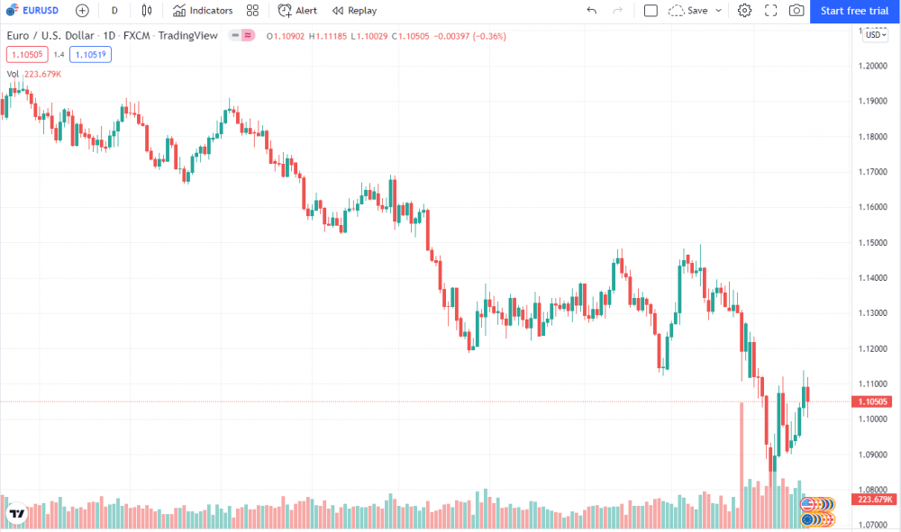
A forex chart is simply a graphical depiction of the exchange rate between two currencies.
It shows how the exchange rate of currency pairs has changed over time.
For example, the chart above (Euro vs. U.S. Dollar) shows how the exchange rate between Euros and U.S. dollars has fluctuated over time.
You can plot forex charts for various currency pairs, from major pairs like EUR/USD and GBP/USD to minor pairs like AUD/CAD and NZD/JPY.
5. How do Forex Chart Timeframes work?
The amount of time shown on the chart depends on the particular timeframe you select.
Our forex charts are set to daily (1D) timeframes by default.
This means that each point on the graph, whether it be a line, candle, or bar, represents the trading data for one day.
If you changed the timeframe to a 60-minute chart, each point would now represent 60 minutes worth of trading data.
Example below:
With most free forex charting tools, you can choose to display timeframes from as low as 1 minute up to one month. If you get more advanced charting software, you can view lower timeframes.
6. Types of Forex Charts
Forex traders have developed several types of forex charts to help depict trading data. The three main chart types are line, bar, and candlesticks. For forex traders, candlestick charts seem to be the crowd favorite, and it's easy to see why.
6.1 Line charts
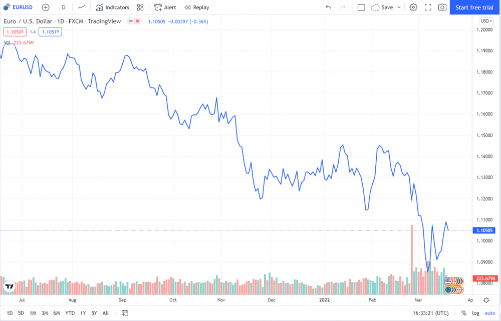
A line chart is the most basic and most straightforward price representation in forex. It marks different price points of a particular asset on the chart and then connects the neighboring points with a solid line.
Below is an example of how the EURUSD course shows on a line chart:
While line charts are straightforward to understand, they are too simple. That's because they only represent the closing prices of currency pairs. The line chart would not provide the necessary details for traders who want to get more complex information like opening or highest / lowest prices.
6.2 Bar charts
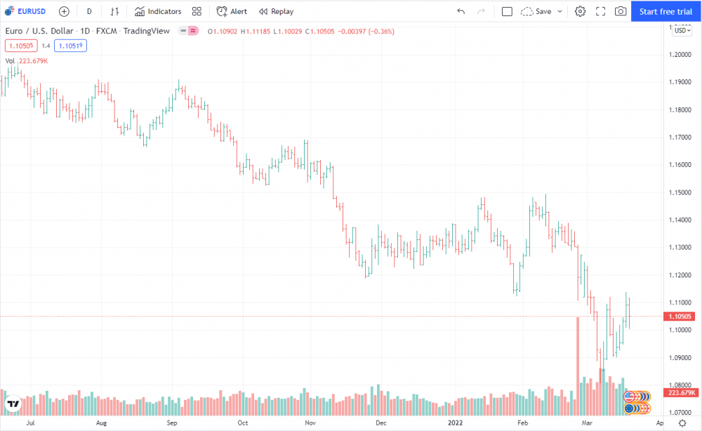
Bar charts are more complex than the line F.X. chart types and offer even more prices than the previous ones. This bar shows four different currency pair prices in a certain period of time - either minutes, hours, days, or higher.
Below is an example of how the EURUSD course shows on a bar chart:
Here are these four prices: The top and bottom of the bar represent the high and low prices of the asset over the period. A short vertical line on the left shows the opening price, and the same one on the right shows the closing price.
Bar charts are far more complex than line charts for obvious reasons: while the line chart represents one price, the bar chart does that for four different prices. But when it comes to the most complex chart type, even the bars aren't enough.
6.3 Candlestick - Most popular forex chart
Candlestick charts combine the two previous types. A candlestick chart is the most popular method for visualizing Forex price movements in a given period of time.
Compared to a line chart, which shows the price close to close, candlestick charts show four times the amount of information, displaying the close, open, low, and high price of a given period.
With these additional details, you can examine "how" the price has moved over a period of time, compared to see where the price was closed.
The red and green parts of a candle are called the "body."
The body of a candle represents the difference between the opening and closing price of the currency for a certain period of time.
If the candle's opening price is lower than the closing price, the candlestick color is green. If the opposite happens and the opening price is higher than the closing price, the candlestick color is red.
The black lines above and below the candles are called 'wicks' or 'shadows.'
Wicks represent the highest and lowest prices reached during the given time period.
7. Support, Resistance, and Moving Averages
As price moves up and down on our charts, it encounters "barriers." If this barrier acts as a floor, keeping the price from dropping any lower, it is known in trading terminology as support. When it acts more as a ceiling and stands in the way of upward moves, it is called resistance.
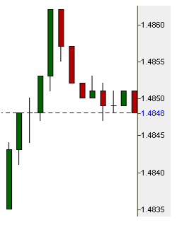
What is interesting to note is that if a certain price level acts as resistance on the way up (such as the Doji candle, which highlights a moment of market indecision on the way up at 1.4848 in the example on the right), then it also has a high probability of acting as support on the way back down (and vice versa).
7.1 What Causes Support & Resistance
When the price is moving up, it means that more people are buying than selling. These bulls eventually need to take their profits. Likewise, bears, who are waiting in the wings and looking for an opportunity to enter short, are more likely to do so the higher the price gets. When the number of sellers eventually overpower the buyers, a resistance level is formed (as shown in the illustration above when the price reached 1.4862). Similarly, when the price moves down, there are more sellers than buyers.
The sellers will eventually need to cover their short positions and take profit. Likewise, if bulls are waiting to buy, the lower the price, the more tempting it becomes for them to enter into new long positions. Eventually, the number of buyers will overpower the sellers, creating a support level.
Since many traders use pending orders set at a specific level, the same level is likely to act as support or resistance multiple times until it finally breaks (as seen in the example above as we approach 1.4848 for the second time, now to test it as support). There can be many different support and resistance levels at any given time, and the wise trader tries to be aware of as many of them as possible so as not to be caught by a surprise reversal.
As price approaches each level, it will either break it and go on to the next or bounce. A good technique may be to zoom out to the longer time frames and draw horizontal lines at key levels where you observe price stalling or reversing. Then, as you zoom in to find your trades, you will have reminders of these critical levels.
7.2 Moving Averages
Additional likely support and resistance levels can be identified by drawing moving averages. A moving average is simply a line chart that shows the average value of a series of periods. There are several different kinds of moving averages. Most are an average of the closing price, though there are cases when they can also be calculated on the high or the low of the periods being averaged.
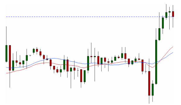
When the value being plotted is a straight average with no modifications, we refer to it as a simple moving average. The blue line in the chart on the previous page represents a 21-period simple moving average (21 SMA) – at any given time, its value reflects an average of the closing prices of the previous 21 candles.
Since the blue line is an average, it is slow to respond to sudden movements in price by its very nature. The red line in the chart above is an exponential moving average for the same 21 periods (21 EMA).
Here there is more value placed upon the most recent candles. And, as you can see, it responds a bit faster to both the sudden drop in price and the rally which follows. Both kinds can have advantages and disadvantages, depending on the situation. As you can see in the above example, moving averages can act as both support and resistance when price approaches them. But unlike regular support and resistance levels, they do not remain at one stationary level and can also move on your chart.
7.3 Common MA Strategies
People use moving averages in many different ways. Traders will often check whether the price is trading above or below its moving average to decide if they are a bull or a bear (especially on a longer time frame). As price gets closer to the moving average, traders look closely to see whether it will bounce back away from it or break that barrier, just as with any other support and resistance level.
And, as price moves further away from its moving average, the trade becomes ever riskier as the price is thought to be out at an "extreme" (since the moving average is still an average, logic suggests that eventually it and price will meet again at the same level). Some people even use crosses of various different moving averages back and forth to signal entries and exits.
7.4 Going Further
Advanced tools which can help us identify other likely support and resistance levels include pivot points and Fibonacci retracements and extensions. The common factor among all support and resistance levels is their likelihood to either break or bounce when the price reaches them, so it pays to be aware of them.
8. Trends & Trendlines
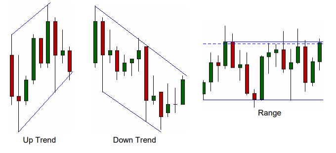
A trend can do one of 3 things: it can go up, go down, or go sideways. An uptrend is defined as having higher highs and higher lows. Similarly, a downtrend is defined as having lower highs and lower lows. When a trend moves sideways, the price is said to be in a range.
8.1 Trendlines
Lines can be drawn connecting the tops of support levels and the lows or resistance levels to form trendlines. Typically, when drawing trendlines, people use the candle bodies instead of the wicks.
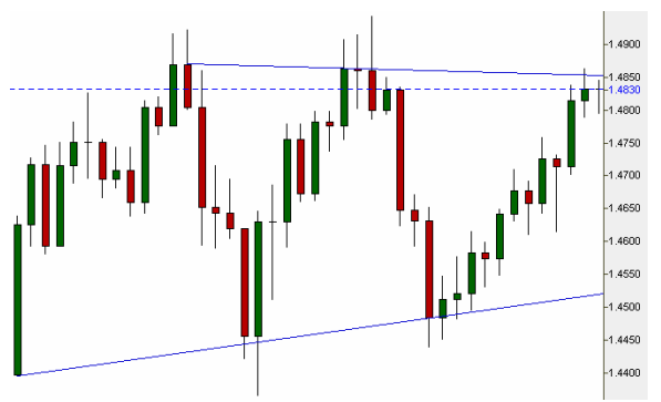
Connecting the prior tops and extending the line gives traders an idea of where resistance is likely to be in the future. Connecting the previous lows gives an idea of future support levels. As long as the price continues obeying these levels, we can continue to trade inside the range – as long as we also stay aware of the other support and resistance levels that may be found inside it.
The trendlines themselves become additional support and resistance levels. When price breaks past the support or resistance levels defined by a trendline, we look to take a trade in the same direction as the breakout. One needs to be cautious, however, as 81% of all breakouts end up being false breakouts – so, therefore, an additional step is necessary to "confirm" them.
8.2 Avoiding False Breakouts: the Re-test
When price breaks below a trendline acting as support, it will typically come back up to test that same level again – but this time as resistance. The best short entries are taken not on the initial break but rather on the second move downwards, following this "re-test" of the level in question.
A successful re-test is defined as a candle body closing outside that level. In the example below, we can see that price broke below support, failed the first retest as resistance, but went on to pass on the second attempt successfully:
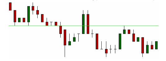
This is a pattern also known as the "good-bye kiss." The same scenario can be reversed when price breaks above a trendline that has previously acted as resistance. Then we look for that same trendline to be re-tested as support before taking a long position.
8.3 The Trendline Break System
One of the most straightforward trading systems can be formed simply by using trendlines. In an uptrend, we connect the bottoms (as shown below). We then look to enter short as soon as price breaks this trendline to the downside.
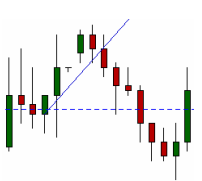
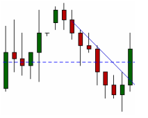
Similarly, in a downtrend, we connect the tops of the candle bodies (as shown to the right). If we are short from before, we look to exit our trade as soon as the price breaks to the upside. If we are not yet in a trade, we may consider taking a long position at this point.
Quick recap
In the second part of our guide, you learned to read FOREX charts, what types of FOREX charts are available, how to identify support, resistance, and moving averages, trends, and trendlines.
In the following part, we will move into more advanced stuff like Forex Indicators and Trading strategies.




.thumb.jpeg.89a9ef7623f450c9051242cc525fb1c5.jpeg)


